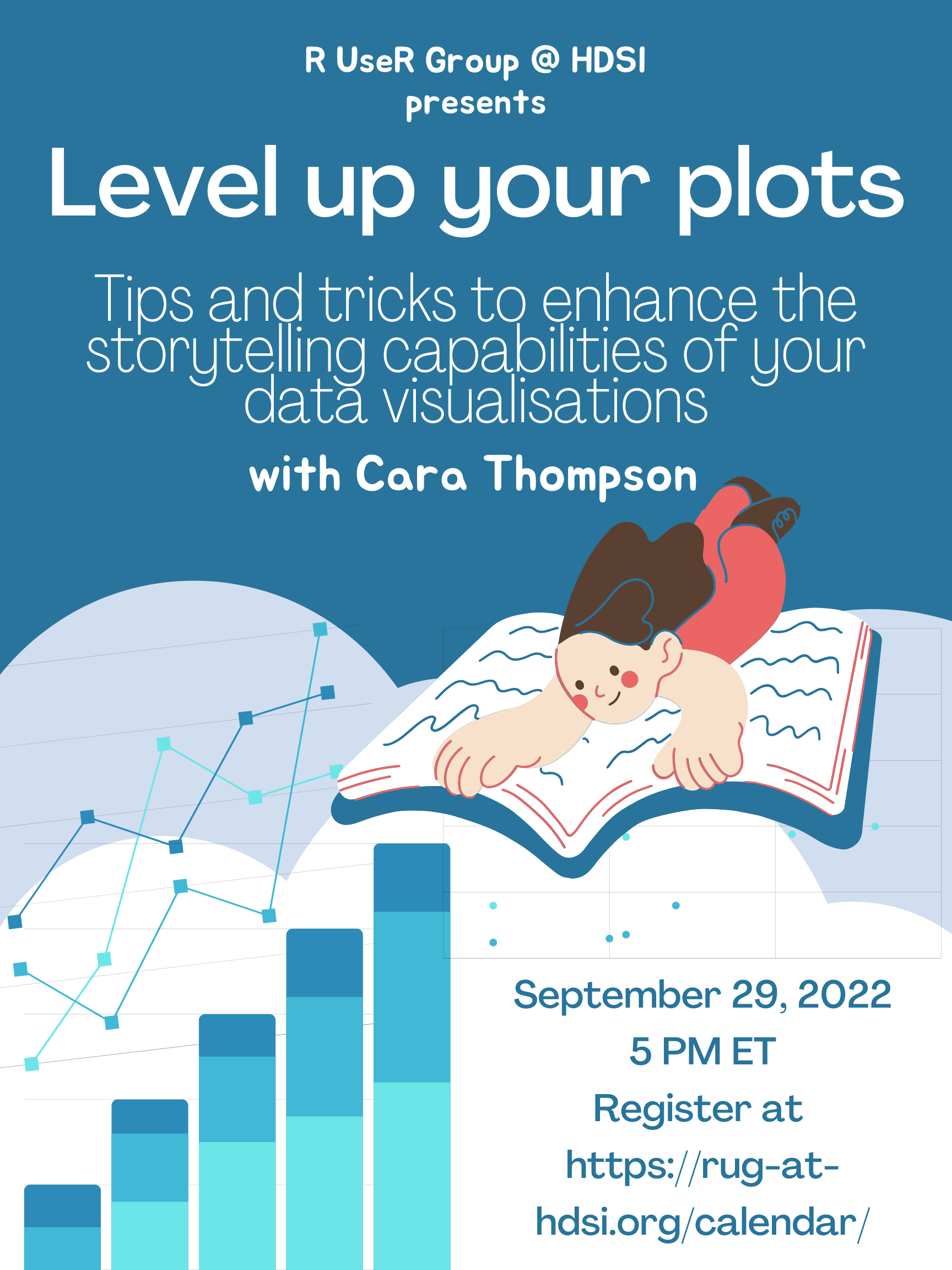
Level Up Your Plots
Join us September 29th, 2022 at 5PM Eastern Time!
Polished annotations can make all the difference between a good plot that contains all the necessary information, and a great plot that engages readers with a clear story.
This talk will build on the Introduction to ggplot session, exploring how we can make good use of design tips (and the coding tricks behind!) to help readers understand
the key messages that our datavisualisations seek to convey. We will build an annotated plot step by step and discuss why we're doing things the way we are along the way.
By the end of the session, you'll have a clear grasp of how to:
- use colour in the explanatory text as well as in the plot to help the readers orient themselves
- use primary and secondary text colours and fonts to help the main message stand out
- create labels to add information about specific data points
- add arrows and use text alignments to draw attention to important details
- modify the theme and other parameters to give everything some space to breathe
Registration Link:
https://harvard.zoom.us/meeting/register/tJIpcuuurzMjGNIMmgBuD-obZGik1Xwy1d64
Bio
Cara is a freelance data consultant with an academic background, based in Edinburgh, Scotland. She specialises in creating clear and engaging datavisualisations, and in automating data-related processes to free up time for experts to invest in their own areas of expertise. A regular contributor to projects at R For The Rest Of Us, Cara enjoys the diversity that comes with working for a broad range of clients. Recent highlights include reworking the datavisualisations for a paper under review and creating an R package for a research group which applies the same aesthetic to all their plots. She’s passionate about helping people make the most of their data.
